This site is designed in collaboration with Joe Davis. By this, I mean that the site was designed and programmed by Joe with input from me about content, context, purpose and typography.
The intention of this website is that it functions as an ongoing, living repository of my practice. I say living, because maintaining it causes a necessary act of reflection of my process, method and output as a creative practitioner. Unlike most sites that go live filled with content, this site started as a blank canvas on which I must add the pieces and puzzles of my potted graphic design history.
Central to the concept of the website are two concerns: the representation of my practice as both process and outcome as well as an expression of some part of the philosophy of my approach.
As noted elsewhere on this site, my work encompasses a range of activity though I have worked primarily with printed matter. I wanted the site to embody some notion of the physicality and craft of my practice as a designer. As a designer, I believe in the adaptability and permeability of concepts, and in the importance of process and iteration.

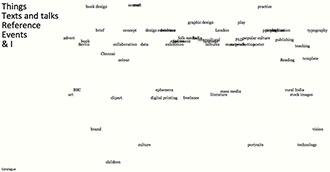
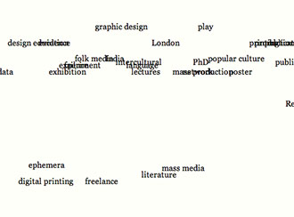
Some of the people who have come to the site assume from the home page that the site isn’t rendering correctly. The reason for this assumption is because the tags on the front page overlap each other. This overlapping is fully intentional. Here’s why:
As en.wikipedia.org/wiki/Tag_(metadata text: Wikipedia) informs us, ‘a tag is a non-hierarchical keyword or term assigned to a piece of information [which] helps describe an item and allows it to be found again by browsing or searching’. The article goes onto note that ‘tags are generally chosen informally and personally by the item’s creator or by its viewer, depending on the system’. We often use tags like cardboard boxes to indicate that they belong in one set and not in another. This is opposed to how things often belong in overlapping categories. As, Eastern philosophy tells us, concepts can be both ‘this’ and ‘that’. There are less categorical absolutes and more dualities in life and creative practice.
The positioning and overlap of the tags on the page is based on a precise grid. The tags are sorted vertically by how recently they have been used and horizontally by alphabet, to create a flexible evolving layout that shows the shape of my thought and process both current and past.

Going back to the physicality of my practice, the overlapping tags suggest concepts of printing and layering. It also suggests mistakes and human error. Any historian will tell you that those are the true marks of any human story.
concept,ephemera,evidence,imperfection,process,rationale,-
