1/21: For Sale is a brief-in-a-booklet that I wrote and designed for my present Second Year students on the BA Graphic Design course at Central Saint Martins College of Art and Design, London.
This is the final brief of their second year and it ends in a very different sort of ‘Work in Progress’ show. The show (which is actually a non-show) will be a sale of items produced for the brief and sold in a pop-up shop space on Clerkenwell Road – the proceeds of which will go towards their final degree show next year. We have been intentional in not having a usual kind of London work-in-progress show where work is sanitised and glorified, and taken out of its actual context. Instead, the intention is to engage with the audience that London as a city provides – the passers-by and specifically non-designers.
I enjoyed very aspect of the making process of this brief. The research (happily conducted off the books in my library), the writing, the editing (thanks to David Preston and Rebecca Ross who provided useful and clear critique), the design and final production.

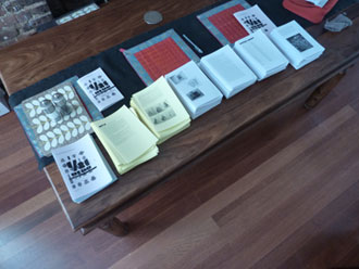
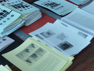
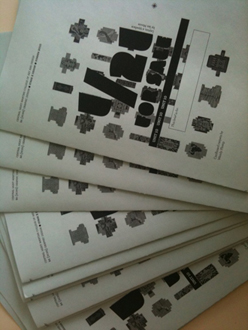
The final 24-page booklet contained the brief, timetable but also important and essential readings. It was produced using 80gsm copier paper, laser printed masters, an ancient protesting photocopier, and rubber bands. As this is a brief about designers as producers, I chose typefaces designed by people rather than corporations. I used Archer designed by Jesse Ragan, Tobias Frere-Jones and Jonathan Hoefler for the body text and Leyton, a chunky yet astonishingly readable typeface designed by Ian Moore for the titles.

I was keen to make the booklet as sustainable as possible – working with the recycled copier paper that was available in college and simple rubber bands from Rymans (easier to recycle than staples). Rebecca had the idea to use coloured paper to separate the content – so the yellow part is the brief, and the readings are printed on white paper. On the day of production, I must confess that I struggle not to over design the booklet but to produce it with the materials available – even if they were a strange yellow and an almost-lilac paper and the photocopier toner was exhausted and weary.
Over the weekend I collated each of the 120 copies (1 for each of the tutors and students taking part in the brief), trimmed and cut them by hand. A mad labour of love (resulting in severe tendonitis!) that was intended to convey to students that this was a physical brief rather than an impersonal pdf document, and that tutors do practice what they preach! On the day of the briefing, each of the 7 tutors personalised copies for the students using a simple label space on the cover.

brief,Central Saint Martins,design education,London,multiples,production,typography,-
